16 Counters Widgets for Web UI Kit: A Design Guide
In the fast-paced world of web development and digital design, clarity is currency. Users scanning a landing page or navigating a dashboard need to grasp key metrics instantly. Numbers tell a story, but how those numbers are presented often determines whether that story is understood or ignored. This is where a specialized resource like the 16 Counters Widgets for Web UI Kit becomes an invaluable asset for professionals aiming to elevate their interface design without reinventing the wheel.
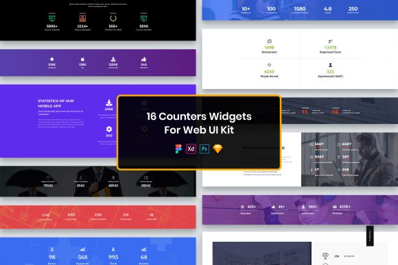
This collection is not merely a set of graphics; it is a structured system designed to streamline the workflow of designers and developers. Whether you are building a SaaS dashboard, a portfolio site, or an e-commerce platform, presenting data effectively is critical. The kit provides sixteen distinct variations of counter widgets, each crafted with a minimal design philosophy that ensures they blend seamlessly into modern interfaces while drawing attention to the most important statistics.
Accelerating Workflow Through Multi-Format Compatibility
One of the most significant hurdles in collaborative design environments is file compatibility. Teams often consist of members who prefer different tools based on their specific roles or operating systems. The 16 Counters Widgets for Web UI Kit addresses this fragmentation by including source files in four major industry-standard formats: PSD, Figma, Sketch, and Adobe XD.
This versatility means that a UX designer working in Figma can hand off assets directly to a visual designer using Sketch, or a developer who prefers inspecting layers in Adobe XD can do so without needing conversion plugins or risking fidelity loss. For freelancers juggling multiple clients with varying tech stacks, this eliminates the friction of format translation. Instead of spending hours recreating a widget to match a client's existing library, you can import the native file, adjust the values, and integrate it immediately. This cross-platform support ensures that the creative process remains fluid, regardless of the software ecosystem your team inhabits.
The Power of Well-Organized Layers
Downloading a UI kit is one thing; being able to actually work with it efficiently is another. A common frustration with free or low-quality resources is disorganized layer structures, where groups are unnamed, elements are merged, or hidden objects clutter the workspace. This kit distinguishes itself through its commitment to well-organized layers. Every element within the sixteen widgets is logically grouped and labeled, allowing for rapid editing.
Imagine needing to change the color scheme of a counter widget to match a brand's secondary palette. In a poorly structured file, this might involve hunting through clipped masks and locked backgrounds. Here, the logical hierarchy allows you to isolate specific components—such as the icon, the number, or the label text—and modify them independently. This level of organization supports a non-destructive workflow, giving you the confidence to experiment with styles knowing you can easily revert changes or adapt the component for different screen sizes.
Enhancing Visual Communication with Minimal Design
The aesthetic approach of this kit centers on minimal design, a choice that serves both functional and stylistic purposes. In data visualization, excessive decoration can distract from the core message. By stripping away unnecessary gradients, shadows, and complex textures, these widgets ensure that the numerical data remains the focal point. This "less is more" approach aligns perfectly with current web design trends that prioritize readability and speed.
For marketers and business owners, this translates to better user engagement. When a visitor lands on a page showcasing "Projects Completed" or "Happy Clients," a clean, uncluttered counter builds trust. It suggests professionalism and precision. The purposeful elements included in each widget are chosen specifically to guide the eye. Whether it is a subtle icon indicating the type of metric or a clear typographic hierarchy distinguishing the count from the description, every pixel serves a function. This thoughtful design reduces cognitive load for the end-user, making the information digestible at a glance.
Precision Across Devices with Pixel Perfect Assets
In an era where users access content on everything from large desktop monitors to high-density mobile screens, resolution independence is non-negotiable. The assets in the 16 Counters Widgets for Web UI Kit are pixel perfect and Retina ready. This ensures that whether your audience is viewing your site on a standard laptop or the latest smartphone, the edges of your icons and text remain crisp and sharp.
Blurry graphics can subtly undermine the perceived quality of a website. By utilizing vector-based elements and high-resolution exports, this kit helps maintain a polished look across all breakpoints. For developers implementing these designs, having assets that scale without degradation simplifies the coding process, as there is less need to create multiple raster versions for different device pixel ratios.
Customization and Typography Flexibility
While the default designs are professional and ready to use, no two brands are identical. The ability to customize is where this kit truly empowers creators. The files are fully customizable, allowing you to alter dimensions, colors, and spacing to fit your unique layout requirements. Furthermore, the kit utilizes free fonts, removing licensing barriers that often complicate commercial projects.
Typography plays a massive role in how data is perceived. A bold, heavy font might convey stability and authority, suitable for financial metrics, while a lighter, rounded font might feel more approachable for social media statistics. The kit includes a "Fonts Used" file in the download package, providing direct links to the typefaces employed. This transparency saves time searching for matching fonts and ensures legal compliance when deploying your design live. You can easily swap these fonts for your brand's proprietary typeface if needed, thanks to the editable nature of the text layers.
Practical Applications for Diverse Professionals
Who benefits most from a tool like this? The applications are broad, spanning various industries and roles:
- Web Agencies: Can rapidly prototype dashboard concepts for clients, demonstrating value early in the discovery phase without committing extensive billable hours to custom illustration.
- SaaS Founders: Often need to highlight key performance indicators (KPIs) on landing pages to prove traction to investors or users. These widgets provide an immediate visual solution.
- Educators and Bloggers: Can use counters to display statistics like "Students Taught" or "Articles Published," adding credibility to their personal brands.
- Small Business Owners: Managing their own websites can find pre-made, professional elements help them achieve a high-end look without hiring a dedicated design team.
Consider a scenario where a nonprofit organization is launching a fundraising campaign. They need to display a live counter of donations received. Using the 16 Counters Widgets for Web UI Kit, they can quickly select a style that matches their emotional tone, customize the colors to their brand, and deploy a trustworthy-looking metric that encourages further giving. The speed of implementation allows them to focus more on the campaign strategy and less on the minutiae of UI construction.
Understanding Limitations and Scope
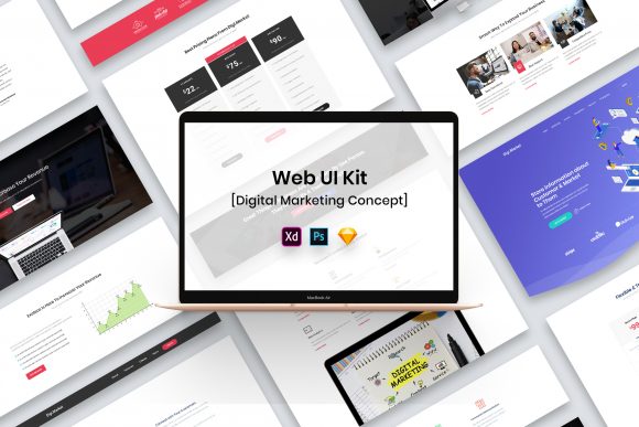
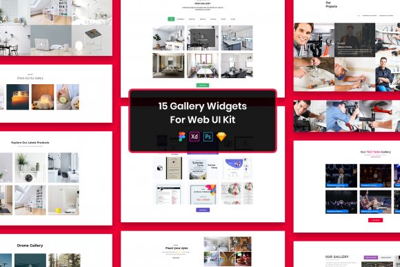
While this kit offers substantial value, it is important to understand its scope to manage expectations effectively. The images, vectors, and mock-ups seen in preview materials are strictly for demonstration purposes and are not included in the final download files. This is a standard practice in the industry to protect the intellectual property of third-party creators whose work is featured in marketing visuals. Users should be prepared to supply their own background images or contextual graphics if they wish to replicate the exact look of a promotional mock-up.
Additionally, while the widgets are highly customizable, they are static design elements. They do not include JavaScript or backend code to make the numbers count up dynamically upon page load. Developers will need to implement the animation logic separately. However, having the visual states perfectly designed in PSD, Figma, Sketch, or XD provides a precise blueprint for developers to follow, reducing the back-and-forth between design and engineering teams.
Making the Right Choice for Your Project
Selecting the right UI resources is about balancing quality, efficiency, and flexibility. The 16 Counters Widgets for Web UI Kit stands out because it respects the user's time. It acknowledges that modern professionals need tools that work immediately across different platforms, adhere to high design standards, and offer the freedom to adapt. By providing well-organized, pixel-perfect, and multi-format files, it removes technical debt from the design phase.
Ultimately, the goal of any UI kit should be to let you focus on solving problems rather than drawing rectangles. Whether you are refining a corporate annual report interface or polishing a startup's MVP, having a reliable set of counter widgets allows you to communicate data with clarity and style. It is a practical investment in your workflow, ensuring that when it comes time to present your numbers, they look as impressive as the results they represent.