Elevate Your Design with a Video Player UI Elements Kit
In the fast-paced world of digital content, the interface through which users consume media is just as critical as the content itself. A clunky, confusing, or aesthetically mismatched video player can disrupt immersion and drive viewers away before they even engage with your message. This is where a comprehensive Video Player UI Elements Kit becomes an indispensable asset for modern creators. Whether you are building a mobile application, designing a streaming platform, or crafting an interactive educational module, having access to high-quality, isolated vector icons and dashboard templates allows you to construct interfaces that are both functional and visually stunning.
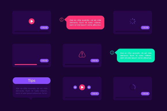
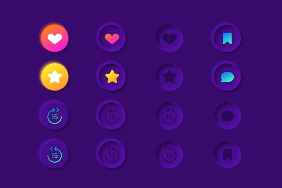
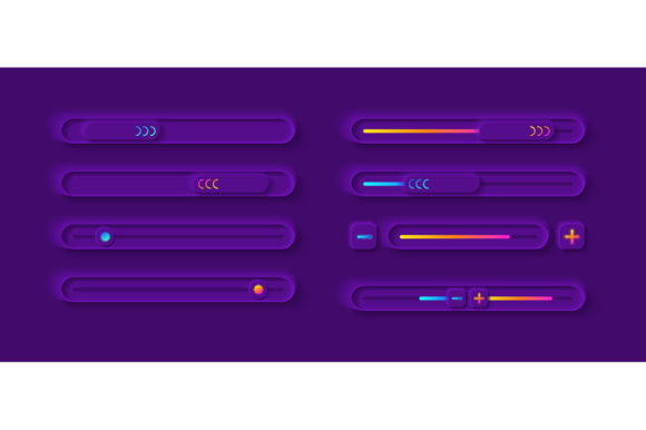
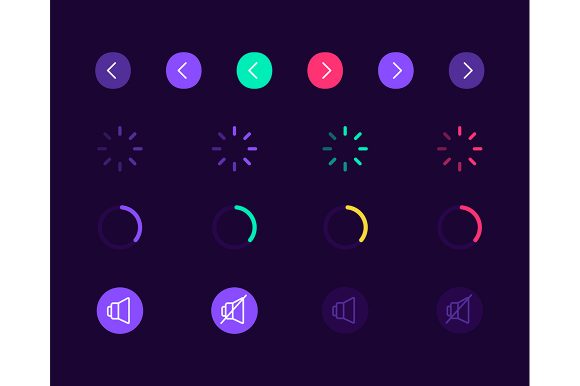
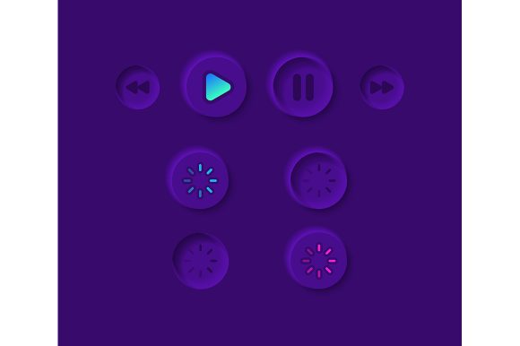
At its core, this kit provides the foundational building blocks for any video playback experience. It includes essential controls like play and pause buttons, volume sliders, progress bars, and fullscreen toggles, all rendered in a sleek dark theme interface. The inclusion of formats such as EPS, JPG, PNG, SVG, and AI ensures that these elements are versatile enough to fit into any workflow, from rapid prototyping in Figma to final production in Adobe Illustrator. For designers and developers, this means saving countless hours on drawing basic shapes and focusing instead on the user experience and brand identity.
The Power of a Dark Theme Interface
The decision to utilize a dark theme interface is not merely a stylistic choice; it is a strategic one rooted in user behavior and visual ergonomics. When users watch videos, especially on mobile devices or in low-light environments, a bright white interface can be jarring and distracting. A dark background allows the video content to take center stage, reducing eye strain and creating a cinematic feel that enhances engagement.
A well-designed Video Player UI Elements Kit leverages this by offering controls that pop against the darkness without overpowering the screen. Think of subtle gradients, semi-transparent overlays, and crisp white or neon-accented icons that guide the user's eye naturally. For marketers and bloggers embedding video content, adopting this aesthetic can instantly elevate the perceived quality of their production, making amateur footage look professional and polished.
Versatility Across File Formats
One of the most practical advantages of this collection is the diversity of file formats included in the ZIP package. Each format serves a specific purpose in the design and development lifecycle:
- SVG and AI: Perfect for scalability. These vector files allow you to resize icons from a tiny mobile button to a massive billboard graphic without losing resolution. They are ideal for developers who need to animate paths or change colors programmatically via CSS.
- EPS: A staple for print and legacy vector workflows, ensuring compatibility with older design software while maintaining editability.
- PNG: Ready-to-use raster images with transparency, excellent for quick mockups, presentations, or web implementation where vector support might be limited.
- JPG: Useful for previewing the assets or using them in non-transparent contexts where file size is a primary concern.
This variety ensures that whether you are a freelance web designer working on a tight deadline or a large agency building a custom app, you have the right tool for the job immediately available.
Creative Applications for Different Industries
The utility of a multimedia isolated vector icon set extends far beyond standard entertainment apps. Different sectors can adapt these elements to meet unique audience needs and functional requirements.
Educators and E-Learning Developers can use these kits to build intuitive course platforms. By customizing the progress bar to show module completion rather than just time elapsed, and using clear, universally understood icons for play and pause, they reduce the cognitive load on students. The dark theme helps maintain focus on the instructional material, minimizing distractions during long study sessions.
Small Business Owners and Entrepreneurs often rely on video to showcase products or share testimonials. Integrating a custom-styled player on their landing pages can significantly increase conversion rates. Instead of using the default, generic player provided by hosting platforms, they can match the player's aesthetic to their brand colors using the editable vector files, creating a seamless and trustworthy user journey.
Content Creators and Bloggers can utilize the dashboard templates to design unique portfolio sites. A cohesive look across all video embeds reinforces personal branding. Furthermore, the isolated icons can be repurposed for social media graphics, thumbnails, or even merchandise, maximizing the value of the single purchase.
Designing for Mobile First
In an era where the majority of video consumption happens on smartphones, the "mobile application" aspect of this widget collection is paramount. Touch targets must be large enough to be tapped easily, yet unobtrusive enough not to block the visual content. The elements in this kit are designed with these constraints in mind.
When adapting these elements for mobile, consider the following practical steps:
- Prioritize Essential Controls: On smaller screens, less is more. Ensure the play/pause button and the scrubber are the most prominent elements. Secondary controls like settings or sharing can be tucked away in a sub-menu to keep the interface clean.
- Optimize Contrast: Even within a dark theme, ensure there is sufficient contrast between the icons and the background video. Test your designs against various types of footage—dark scenes, bright landscapes, and everything in between—to guarantee visibility.
- Responsive Scaling: Use the SVG files to ensure your buttons scale perfectly across different device densities, from older phones to the latest high-resolution tablets.
Maintaining Consistency and Originality
While templates provide a head start, the goal is to create something that feels original and aligned with your specific project goals. The danger of using pre-made kits is ending up with a generic look that blends in with thousands of other sites. To avoid this, treat the Video Player UI Elements Kit as a canvas rather than a finished product.
Experiment with color accents. If your brand is known for a vibrant orange, apply that hue to the progress bar and the active state of the play button. Play with the opacity of the background overlay to find the perfect balance between readability and immersion. You can also combine these vector icons with custom typography or unique animation curves to give the player a distinct personality.
Consistency is key to a professional result. Ensure that the style of your video player matches the rest of your website or application. If your site uses rounded corners and soft shadows, make sure the player controls reflect that language. The modular nature of this kit allows you to mix and match elements to achieve this harmony without needing to draw everything from scratch.
Future-Proofing Your Media Strategy
Investing in a high-quality UI kit is an investment in the longevity of your digital presence. As video formats evolve and user expectations shift, having a flexible set of assets allows you to iterate quickly. Need to add a "speed control" toggle next month? The existing style guide provided by the kit makes adding new elements seamless. Planning to expand from web to native iOS and Android apps? The vector files ensure your branding remains sharp across all platforms.
Ultimately, the Video Player UI Elements Kit is more than just a folder of icons; it is a toolkit for better communication. It empowers you to remove friction between your audience and your content, ensuring that your message is delivered clearly, beautifully, and effectively. By leveraging these resources, you free up your creative energy to focus on what truly matters: telling compelling stories that resonate with your audience.