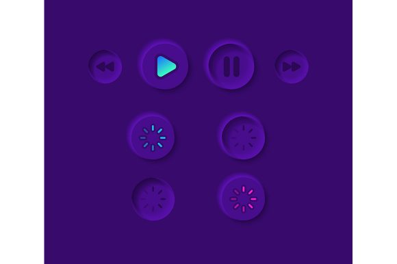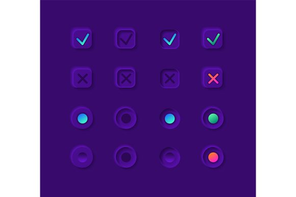
Streamlining Mobile Interfaces with the Notification Buttons UI Elements Kit
In the fast-paced world of mobile application development, the difference between a user who stays and one who leaves often comes down to the clarity of the interface. We have all experienced that moment of frustration when trying to dismiss an alert or find a critical action button in a sea of cluttered design elements. This is where a specialized resource like the Notification Buttons UI Elements Kit becomes more than just a collection of graphics; it transforms into a vital tool for crafting intuitive user experiences. Whether you are a seasoned product designer or a startup founder looking to polish your MVP, understanding how to leverage pre-built, high-quality UI components can save hours of tedious work while elevating the overall aesthetic of your project.
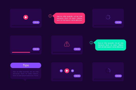
At its core, this kit is a comprehensive library designed specifically for modern mobile applications, with a sharp focus on dark theme interfaces. The shift toward dark mode has moved from a trendy alternative to a standard expectation for many users, particularly those who consume content late at night or prefer high-contrast visuals to reduce eye strain. Designing for dark themes isn't as simple as inverting colors; it requires a nuanced understanding of depth, shadow, and vibrancy. The Notification buttons UI elements kit addresses these specific challenges by providing vector icons and button states that are already optimized for low-light environments. Instead of guessing which shade of gray works best against a black background, designers can pull directly from a curated selection that ensures readability and visual harmony.
Real-World Applications Across Industries
The versatility of this asset pack shines when we look at how different industries can apply these elements to solve specific communication problems. Consider the fintech sector, where security alerts and transaction confirmations need to be immediate and unmistakable. A banking app utilizing these multimedia markers can present a "Transaction Successful" notification that feels secure and professional, using the included bar and dashboard templates to integrate the alert seamlessly into the user's financial overview. The vector nature of the files means these icons remain crisp on any screen density, from older smartphones to the latest high-resolution tablets, ensuring that critical financial information is never lost to pixelation.
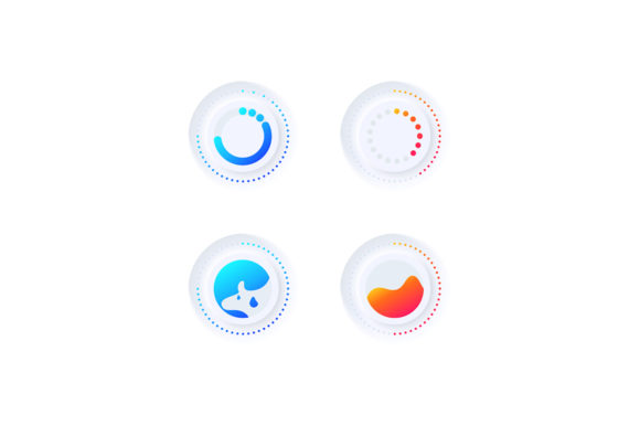
In the realm of health and fitness tracking, the stakes for user engagement are equally high. Imagine a workout app that needs to nudge a user to hydrate or celebrate a milestone without breaking their flow. The widget collection found in this kit allows developers to create non-intrusive pop-ups that align with the energetic vibe of the brand. Because the files are isolated vector icons, they can be easily recolored to match specific brand guidelines—perhaps changing a standard blue success checkmark to a vibrant neon green that pops against the dark interface. This level of customization helps maintain brand consistency while utilizing the structural reliability of pre-tested UI patterns.
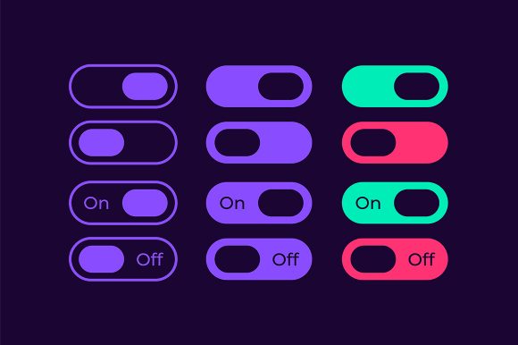
E-commerce platforms also benefit immensely from having a robust set of notification tools. When a flash sale ends or an item in a wishlist drops in price, the notification needs to create a sense of urgency without feeling spammy. The diverse range of button styles and dashboard templates included in the ZIP file allows designers to experiment with different hierarchies. You might use a bold, filled button for a "Buy Now" call to action within a notification, while employing a subtler outline style for a "View Later" option. This distinction guides the user's eye naturally, improving conversion rates through thoughtful design rather than aggressive tactics.
Technical Advantages and Workflow Efficiency
One of the most practical aspects of this kit is the sheer variety of file formats provided: EPS, JPG, PNG, SVG, and AI. For a design team, this flexibility is a game-changer. Developers working directly in code might prefer the scalability of SVG files, which can be embedded directly into the application bundle without losing quality. Meanwhile, UI designers prototyping in tools like Adobe Illustrator or Sketch will find the AI and EPS files indispensable for tweaking shapes and adjusting layouts before handing them off. The inclusion of raster formats like PNG and JPG ensures that even if a team member is working in a presentation deck or a marketing mockup, they have immediate access to high-quality assets without needing specialized vector software.
The focus on a dark theme interface is particularly noteworthy because it solves a common pain point: contrast management. In light mode, shadows and borders are often used to define boundaries. In dark mode, designers must rely on subtle shifts in luminance and color saturation. The elements in this collection have likely been tested to ensure they meet accessibility standards, meaning the text and icons stand out clearly against dark backgrounds. This reduces the risk of launching an app that looks great on a designer's calibrated monitor but is illegible on a user's budget smartphone with lower brightness settings.
Strategic Considerations for Implementation
While having a rich library of assets is incredibly beneficial, it is important to approach the integration of the Notification Buttons UI Elements Kit with a strategy in mind. The biggest pitfall in UI design is inconsistency. Just because you have fifty different styles of buttons and icons doesn't mean you should use them all in a single application. Successful implementation involves selecting a cohesive subset that matches your app's personality. If your brand is minimalist, stick to the cleanest lines and simplest icons in the set. If your brand is playful, lean into the more decorative multimedia markers. Consistency builds trust; users learn how to interact with your app faster when the visual language remains predictable.
Another consideration is the context of the notification itself. A critical error message requires a different visual weight than a friendly "welcome back" tip. The bar and dashboard templates included in the kit offer a structural foundation, but the responsibility lies with the designer to ensure the message matches the medium. For instance, using a celebratory icon for a system error would confuse users and degrade the experience. It is essential to map out your notification hierarchy before dragging and dropping assets. Decide which actions are primary, which are secondary, and which are purely informational, then assign the appropriate elements from the kit to those categories.
Furthermore, while vector graphics offer infinite scalability, performance on mobile devices is always a concern. While SVGs are generally lightweight, embedding too many complex vectors can sometimes impact rendering speeds on lower-end devices. It is wise to audit the final build to ensure that the richness of the UI does not come at the cost of app performance. The availability of PNGs in the package offers a fallback option; for static icons that do not need to scale dynamically, a well-optimized PNG might be more efficient for the processor to render than a complex SVG path.
Empowering Creativity Through Constraints
Paradoxically, having a defined set of elements can boost creativity. When designers are faced with a blank canvas, they can suffer from decision paralysis. By starting with the solid foundation of the Notification buttons UI elements kit, the heavy lifting of shape construction and color balancing is already done. This frees up mental energy to focus on higher-level problems: How does this notification fit into the user journey? Does this button placement feel natural? How can we make this interaction delightful?
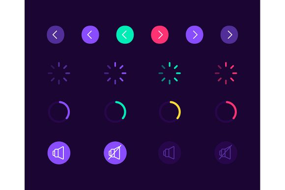
The kit serves as a springboard for innovation rather than a rigid template. Because the icons are isolated, they can be combined, layered, or animated. A developer could take a standard bell icon and add a custom CSS animation to make it pulse when a new message arrives, using the vector paths as the base. The modular nature of the web design widget collection encourages this kind of experimentation. It allows teams to iterate quickly, testing different variations of a notification flow without having to redraw assets from scratch every time a stakeholder requests a change.
Ultimately, the value of this resource lies in its ability to bridge the gap between concept and execution. In an industry where speed to market is crucial, being able to download a ZIP file and immediately start assembling a professional-grade interface is a significant advantage. Whether you are building the next social media giant or a niche utility tool, the clarity of your notifications defines the quality of your user relationship. By leveraging a specialized kit tailored for dark themes and mobile contexts, you ensure that your communications are not just seen, but understood and acted upon.