Media UI Elements Kit: Build Better Apps
Designing a mobile application often feels like trying to build a house without bricks. You have the blueprints and the vision, but assembling the small, functional pieces that make the interface usable can consume weeks of your time. This is where a comprehensive Media UI Elements Kit becomes an invaluable asset for creators, entrepreneurs, and developers alike. Whether you are a seasoned professional or a beginner launching your first startup, having access to pre-designed, high-quality interface components can drastically accelerate your workflow while ensuring a polished final product.
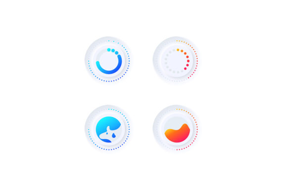
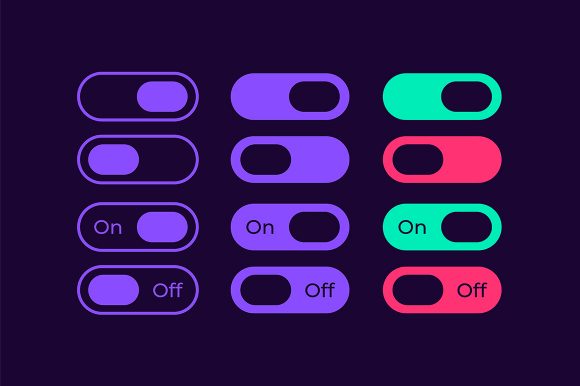
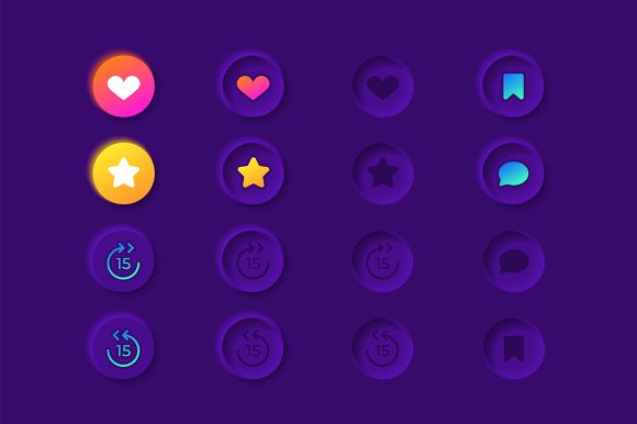
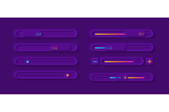
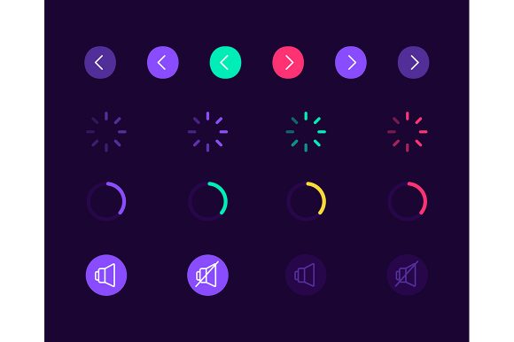
At its core, this kit is a curated collection of vector icons, bars, dashboard templates, and widgets specifically tailored for multimedia applications. Imagine you are building a music streaming service, a podcast platform, or even a video editing tool for mobile devices. The user interface needs to feel intuitive, modern, and responsive. Instead of drawing every single play button, volume slider, or equalizer bar from scratch, you gain immediate access to a library of assets that are ready to integrate. The Media UI elements kit focuses heavily on the nuances of media consumption, providing isolated vector icons for settings, playback controls, and navigation that adhere to current design trends.
Why Visual Consistency Matters in Media Apps
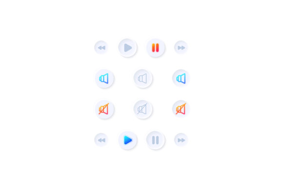
When users open a music player or a video dashboard, they expect a certain level of fluency. If the icons look mismatched or the sliders feel clunky, the entire experience suffers. One of the primary values of using a dedicated Media UI Elements Kit is the guarantee of visual consistency. Every element, from the smallest pause icon to the complex dashboard layout, is designed with a unified aesthetic. In this specific collection, the focus is on a light theme interface, which offers a clean, airy, and modern look that is particularly popular in lifestyle and productivity applications.
A light theme does more than just look good; it enhances readability and reduces visual clutter. For beginners who might not have a background in color theory or contrast ratios, starting with a professionally designed light theme removes the guesswork. You don't have to worry about whether your text is legible against the background or if your icons stand out enough. The kit handles these foundational design principles for you, allowing you to focus on the functionality and content of your application.
What Is Inside the Package?
Understanding the technical deliverables is crucial before integrating any design asset into your project. This particular Media UI Elements Kit is delivered as a ZIP file containing a versatile range of formats: EPS, JPG, PNG, SVG, and AI. This variety ensures compatibility with almost any design software or development environment you might be using.
- AI and EPS: These are vector formats ideal for Adobe Illustrator. They allow you to scale any icon or widget to any size without losing quality. If you need to tweak the curve of a progress bar or change the stroke width of an icon, these editable files are essential.
- SVG: Scalable Vector Graphics are perfect for web and mobile development. They render crisply on all screen resolutions and can be styled directly with CSS, making them a favorite among frontend developers.
- PNG and JPG: These raster formats are useful for quick prototyping, presentations, or instances where a static image is required immediately without further editing.
The inclusion of a music player template and multimedia settings isolated vector icons means you aren't just getting generic shapes. You are receiving functional components that solve specific problems. For instance, the dashboard template provides a layout structure for displaying song lists, album art, and playback controls in a logical hierarchy. This saves you from staring at a blank canvas, wondering where to place the "next track" button.
Practical Use Cases for Creators and Businesses
The versatility of this kit extends far beyond just building the next Spotify competitor. Consider a fitness coach creating an app for their clients. They might need a simple audio player for guided meditation or workout playlists. By utilizing the Media UI Elements Kit, they can quickly assemble a professional-looking interface that matches their brand's clean aesthetic without hiring an expensive design agency.
Similarly, educators developing e-learning modules can use these widgets to create engaging video lessons. The multimedia settings icons allow students to easily adjust volume, toggle captions, or change playback speed. For small business owners launching a promotional app, the light theme interface conveys transparency and professionalism, helping to build trust with potential customers.
Freelancers and hobbyists also benefit significantly. If you are a blogger looking to embed a custom audio player on your site, having access to SVG icons and bar templates allows you to create a unique player that doesn't look like a default browser component. It adds a layer of polish that distinguishes your content from the competition.
Key Considerations Before You Start
While the benefits are clear, there are a few practical things to keep in mind when adopting a new design kit. First, consider your customization needs. Although the Media UI Elements Kit comes with a beautiful light theme, your brand might require specific accent colors. Because the files include AI and EPS formats, you have the freedom to recolor elements. However, ensure you understand how to work with vector layers if you plan on making significant modifications.
Secondly, think about the context of your application. A light theme is excellent for daytime use and general clarity, but if your app is primarily used in low-light environments (like a movie watching app), you might need to consider how these elements translate to a dark mode or if you need to create inverted versions. The high-quality vector sources make this adaptation easier, but it is a factor worth planning for early in the design process.
Finally, remember that a UI kit is a foundation, not a finished product. The bar and dashboard template gives you the structure, but the user experience depends on how you implement logic and interaction. Ensure that the size of the touch targets (like the play buttons) meets accessibility standards for mobile devices, so users with different hand sizes can navigate your app comfortably.
Streamlining Your Workflow
In the fast-paced world of digital product development, time is often the most scarce resource. Spending days designing basic controls is time taken away from testing, marketing, and refining your core features. By leveraging a robust Media UI Elements Kit, you effectively outsource the tedious part of the design process to experts. This allows you to maintain a high standard of quality while moving much faster toward your launch goals.
Whether you are coding the frontend yourself or handing off designs to a developer, having organized assets in formats like SVG and PNG smooths the collaboration process. Developers appreciate clear, scalable assets that don't require constant clarification, and designers love the flexibility to iterate quickly. Ultimately, this kit serves as a bridge between a rough idea and a tangible, interactive reality, empowering you to bring your multimedia visions to life with confidence and style.